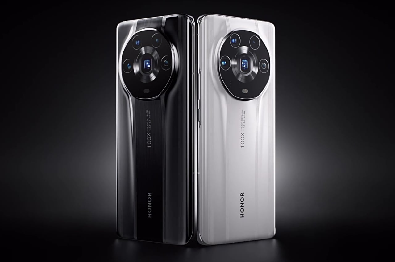
Smartphone cameras are getting bigger, and manufacturers are getting bolder with their designs. Former Huawei subsidiary Honor seems to be taking both ideas to hear, but not exactly in a good way.
It’s not unusual for a single smartphone manufacturer to release multiple models under the same name, often to confusing effect. It’s also not unusual for those variants to differ slightly in their design, also to sometimes confusing degrees. Honor’s latest flagship, however, leaves no room for ambiguity as there is currently no other smartphone that looks like it. Hopefully, there will also be no other smartphone that will ever look like it, and brands will stay away from a design that brings attention to itself without providing many benefits in terms of usability or aesthetics.
Designer: Honor
Design Consciousness
Smartphone brands have thankfully become more conscious of the designs of their products, both in terms of visual appeal and ergonomics. Formerly believed to be Apple’s territory, some companies have become more attentive and even more talkative about the design thinking behind their latest creations. This means that the smartphone industry has started to move towards making these devices more human and more humane, appealing to the senses as much as they appeal to the mind.
Sometimes it works, like in the case of the iPhone and, more recently, OPPO’s and realme’s bold designs. While all products naturally go through the process of product design, not all smartphones reflect this in their final form. Brands like Samsung and Huawei are more than happy to wax philosophical about their design process, but the best designs are the ones that really don’t need a documentary to go along with them.
In some cases, it almost feels as if there wasn’t much thought given to the design at all, resulting in something that looks and feels like a mishmash of ideas and design elements. It’s almost as if someone simply took pieces that may have worked in older products and then smashed them together, hoping that the result will be the sum of its parts.
Center of Distraction
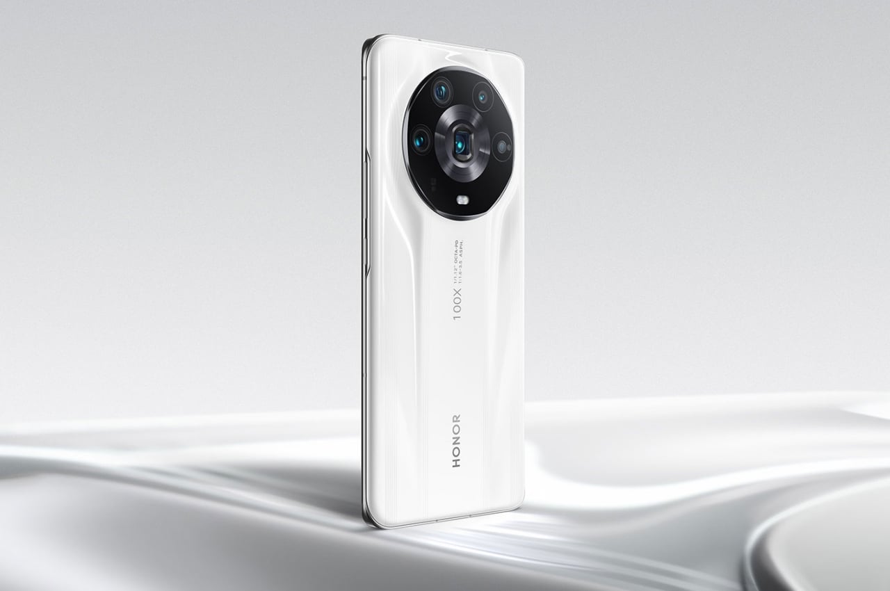
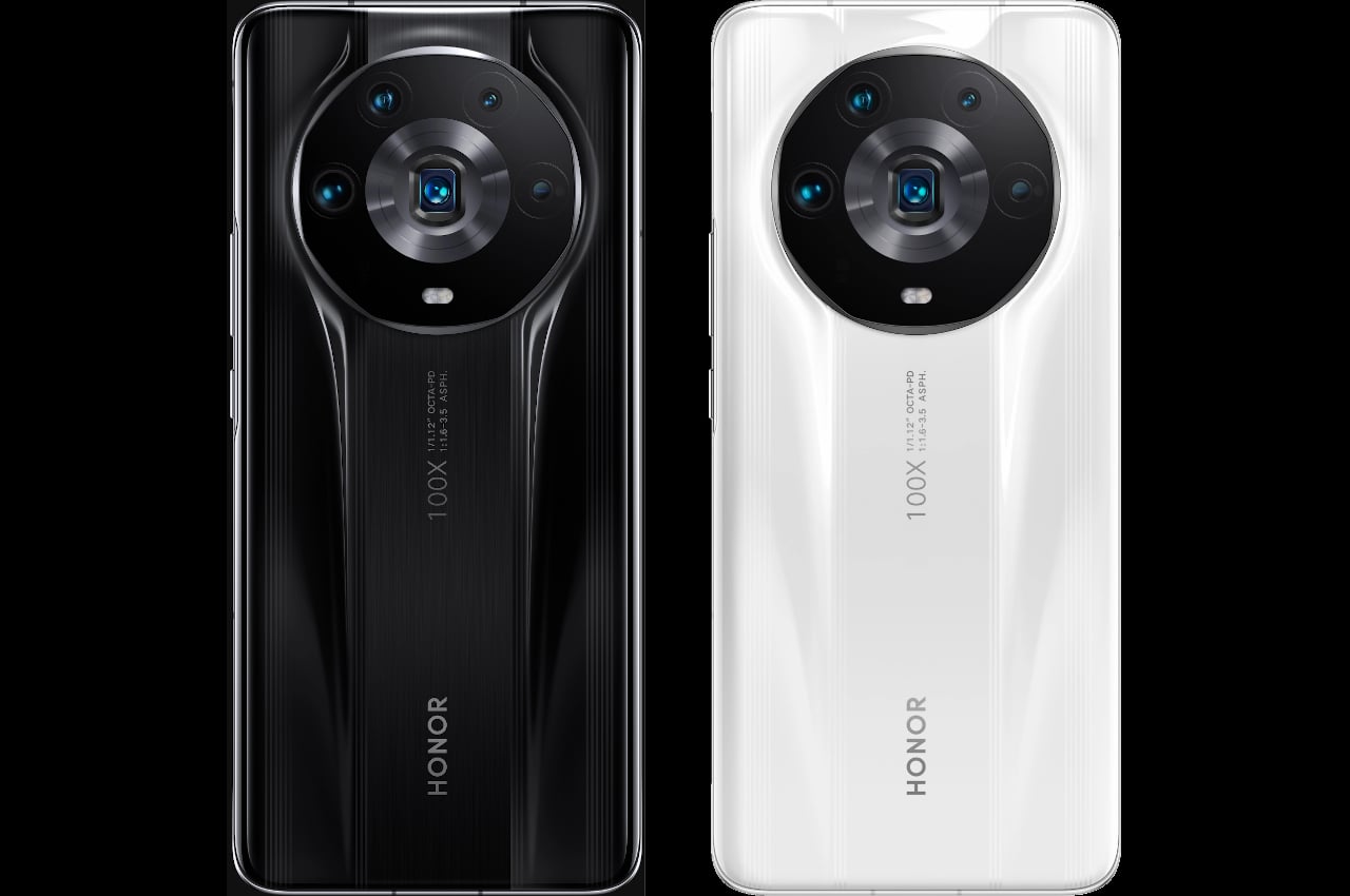
You can almost see that in the Honor Magic 4 Ultimate, the latest and probably final variant in the Magic 4 series from the old Huawei sub-brand. The large circular camera bump is not exactly new, and the gently rising structure has been done before as well. With the Magic 4 Ultimate, however, these elements are magnified to the extent that makes them the visual and conceptual focus of the phone.
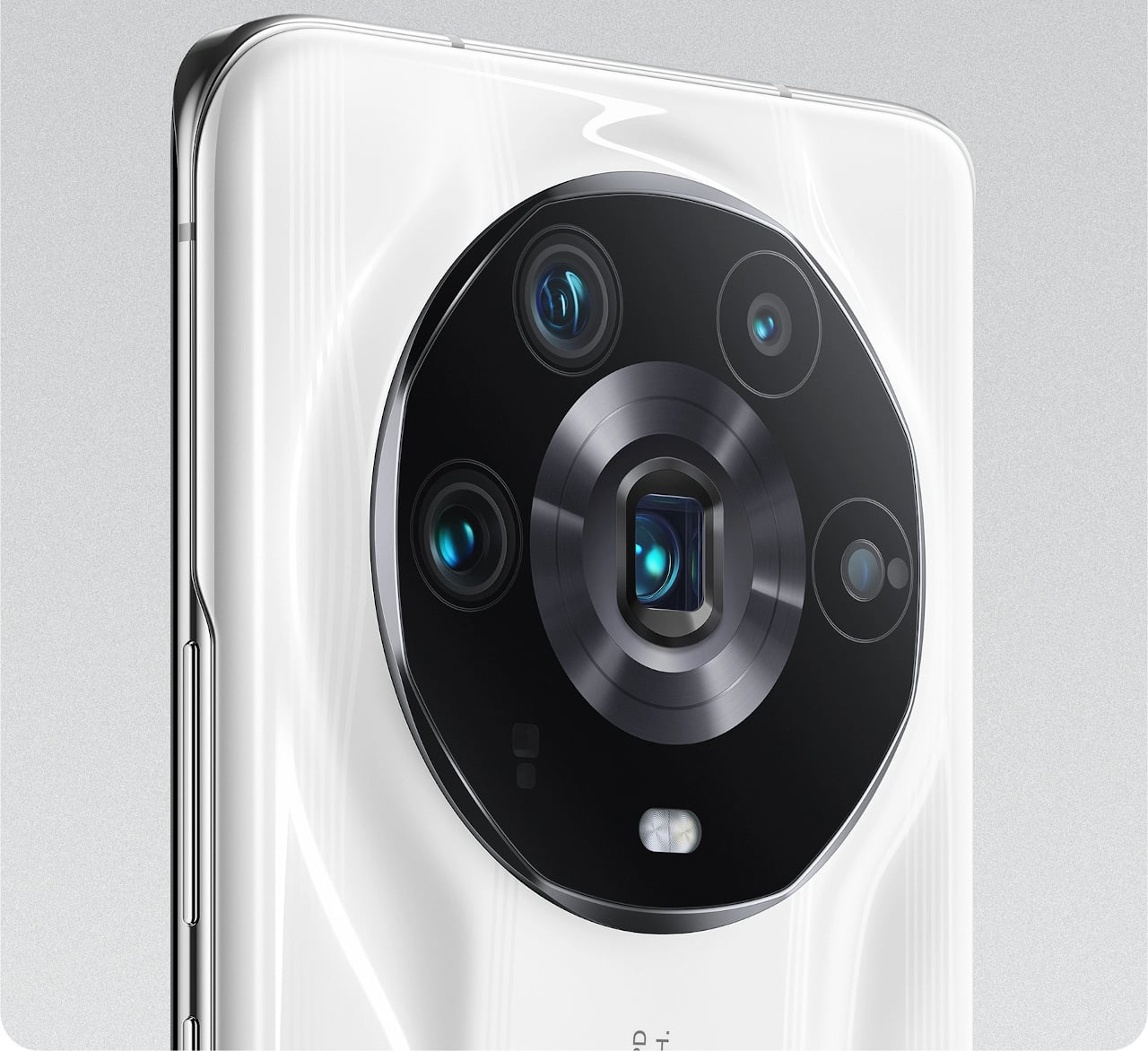
To some extent, that’s actually true and probably intentional. The Honor Magic 4 Ultimate was launched with a heavy focus on the cameras, which occupy more space than most camera arrays do. It’s not like they actually need that much space, especially if they are arranged in a more compact and efficient manner. Honor intentionally chose a design that enthrones the cameras, as if the phone is a digital camera first and only a phone second.
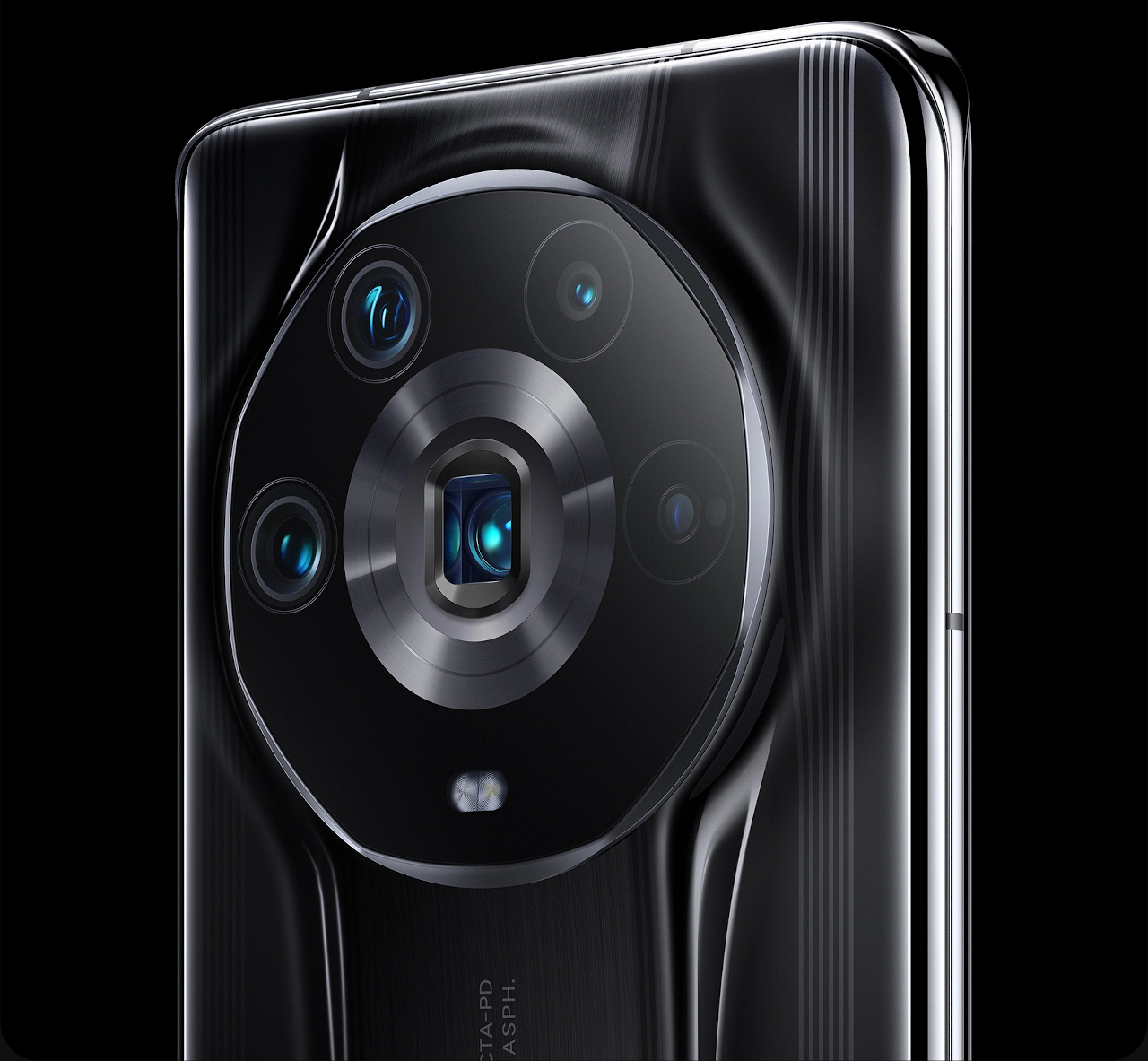
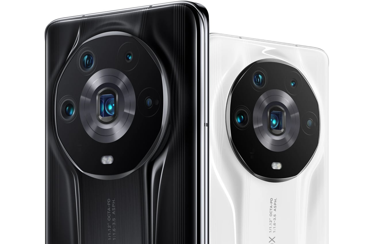
Unfortunately, the smorgasbord of visual elements plays against each other in an almost disharmonious way. In effect, you have a large circle enclosing a hexagon with smaller circles in it and a rectangle in the middle with another circle inside. There are times when a mix of shapes and forms contrast with each other in a pleasing manner. This doesn’t seem to be the case, and the arrangement of elements seems almost messy.
Ergonomic Balance
There’s also the way how the camera bump is made to look like it’s rising out of the back of the phone. To its credit, Honor tried to make it look more natural with inclined planes from the top and from the bottom, rising to meet the camera bump’s elevation. Some manufacturers or models, like other Honor Magic 4 variants, simply have the camera bump jut out like a wart.
Unfortunately, this creates both unnecessary visual noise and some level of imbalance. Due to the lack of space, the left and right sides of the camera bump don’t have the same inclined structure but instead make use of a soft, curved slope. The visual elements do effectively guide your eyes towards the camera bump but do so in a way that is almost jarring and confusing.
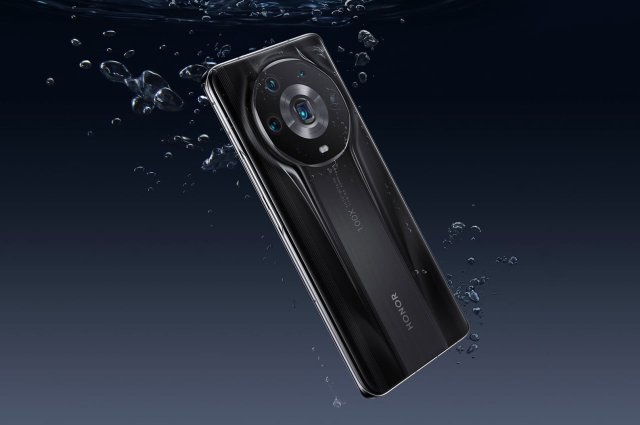
More importantly, the form of the camera’s back panel raises (no pun intended) questions about ergonomics. While Honor will boast of its ability to produce such a shape, it could make holding the phone more awkward and, worse, more prone to being dropped. The fingers, in particular, will be forced to curve around the incline, which could weaken the person’s grip instead of strengthening it.
The Honor Magic 4 Ultimate is definitely an interesting phone in terms of design, though that shouldn’t immediately be seen as a net positive. It is clear that Honor is trying to mix things up in order to make this particular model stand out from its own siblings, but it does so in a way that looks confused and contrived. It could even result in a worse experience as far as ergonomics are concerned, which makes it a good example of poor product design.
The post Honor Magic 4 Ultimate phone design stands out in the wrong ways first appeared on Yanko Design.
from Yanko Design

0 Comments