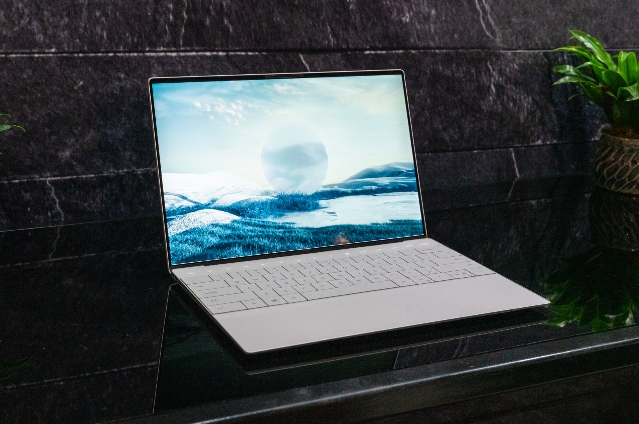
Laptops have become the go-to computing solutions of people, be it for personal use or for work. They have reached a point where they can match desktop computers in all but the most specialized cases, though the ability to expand their power through things like external graphics docks evens out the score as well. Laptop design, in general, has remained the same in the past few decades, at least as far as the placement of components goes. Some have, of course, become thinner and lighter have almost all but banished bezels, but the placement of screens, keys, and trackpads are more or less standard by now (even if keyboard layouts aren’t). Dell, however, is trying to mix things up a bit to make the laptop look more futuristic and less busy, but it raises some important questions about the usability and ergonomics of such a new design.
Designer: Dell
Laptop Ergonomics
One can argue that laptops have never been the most ergonomic computing devices in the first place. Their overall design was meant to make a computer more portable, going as far as being able to use it on your lap. The strain it puts on your legs and neck, and the angle of your arms and wrist have made laptops have made the earliest laptops the anti-thesis of ergonomics.
Things have improved over the decades, but more thanks to accessories and peripherals rather than the actual design of laptops themselves. The position and angle of the screen, keys, and touchpad still don’t lend themselves well to good posture, and manufacturers haven’t exactly been too keen on changing a working formula. Instead, the likes of Dell, ASUS, and Lenovo have tried to reinvent the laptop with features that drastically change how you use it.
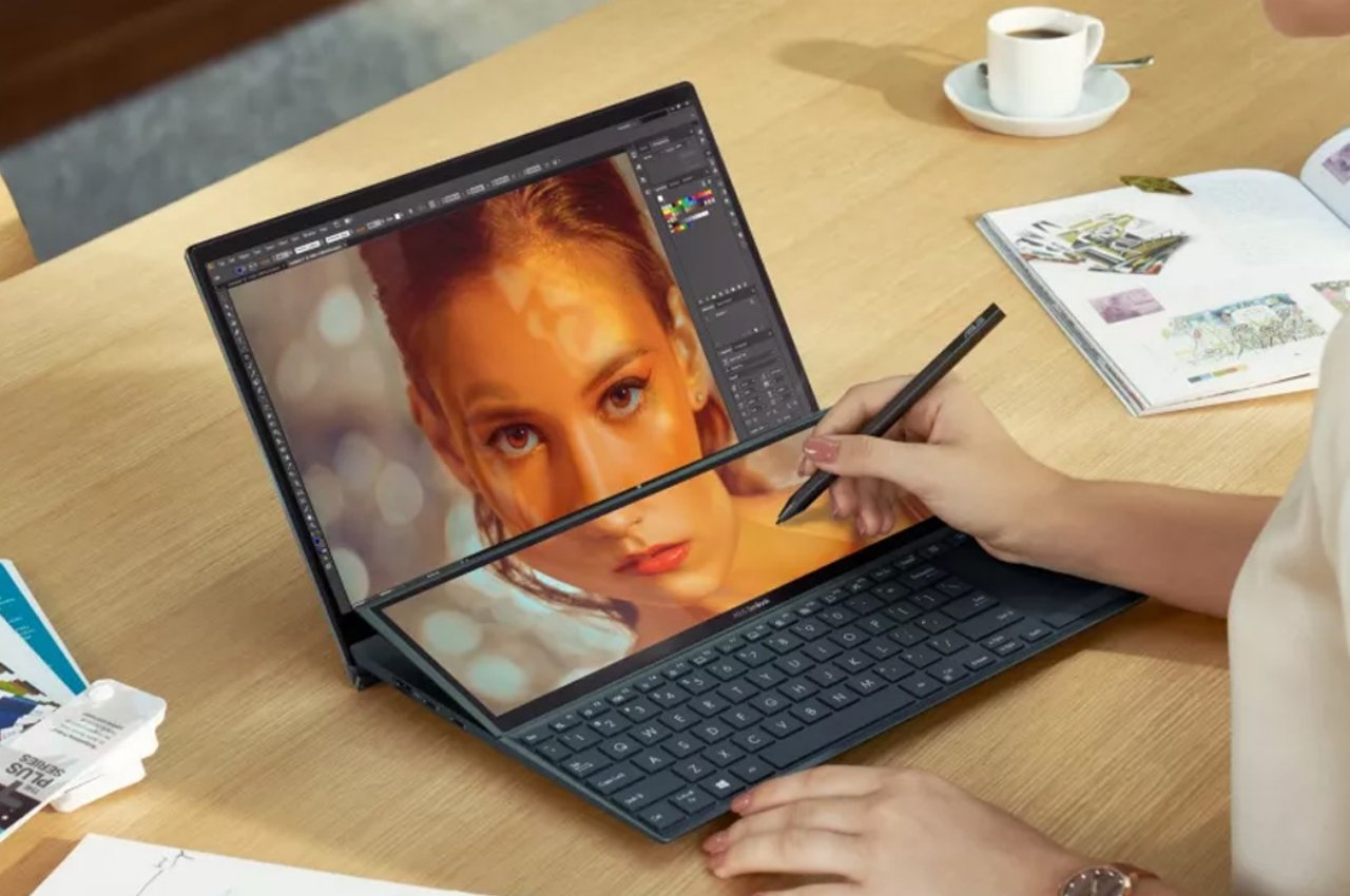
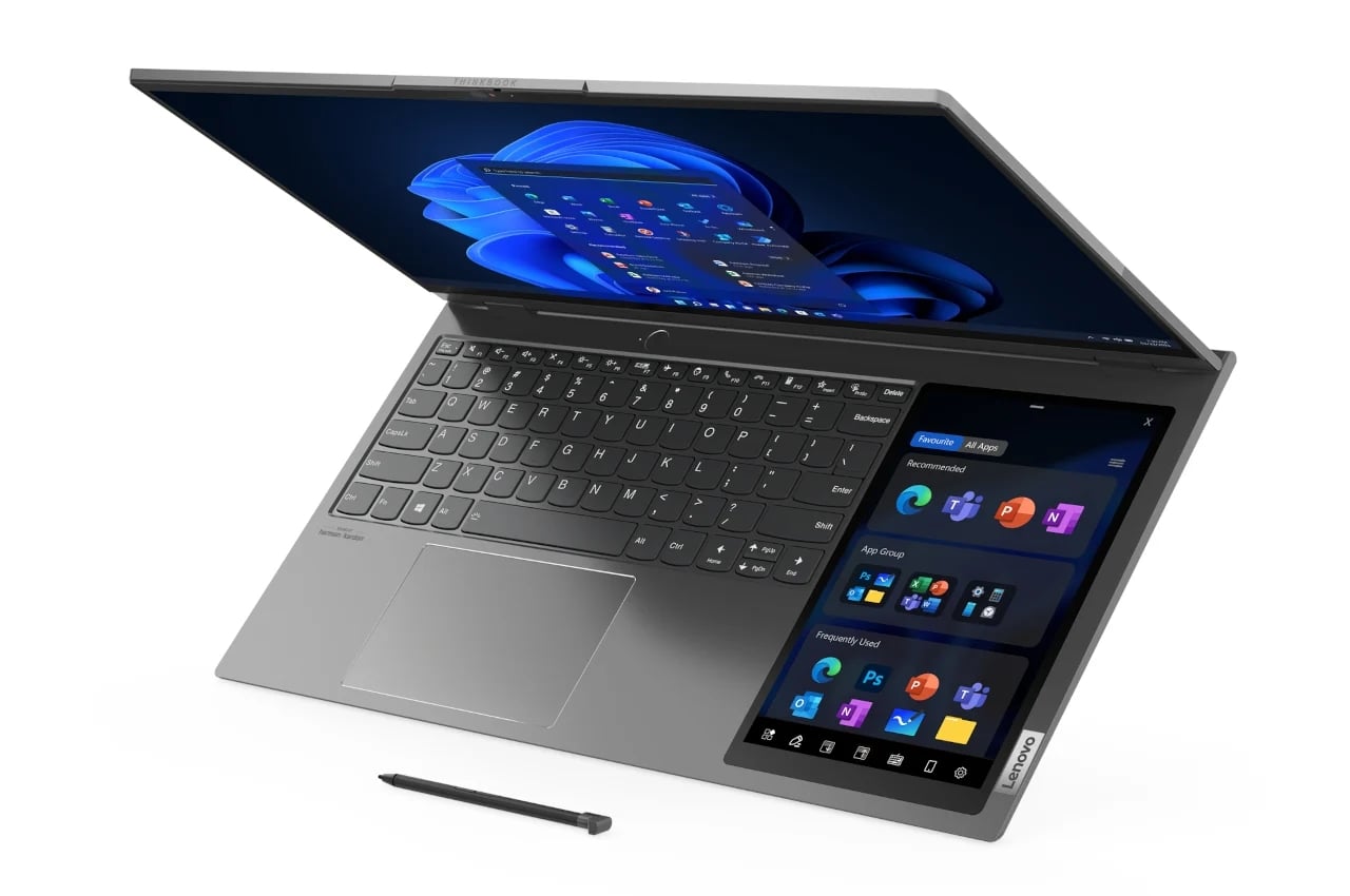
ASUS, for example, has been putting a second screen right above the keyboard, which ends up pushing the keyboard further down. This means that the traditional trackpad is given the boot, though technically, it has been relocated to the right side as a configurable second screen. Lenovo takes that to the extreme by actually putting a tablet-sized display to the right of the keyboard, though the trackpad is still there, now off to the left instead of dead center.
Dell XPS 13 Plus
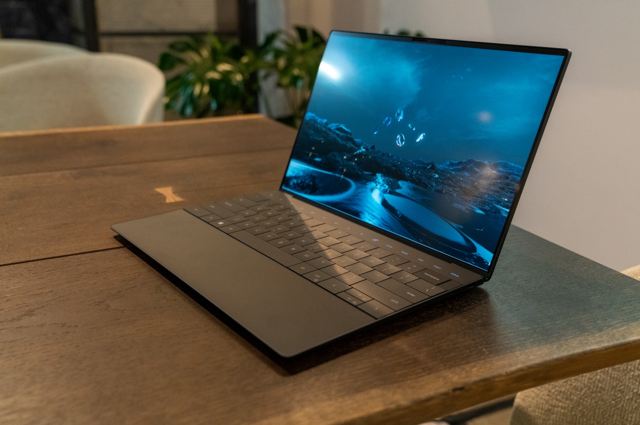
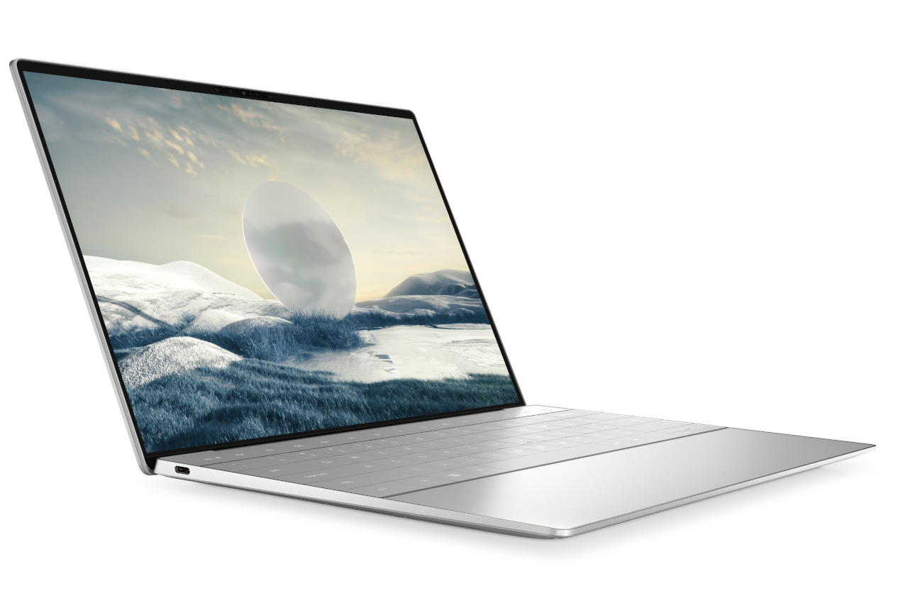
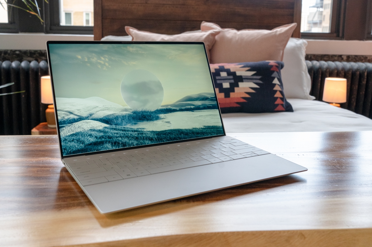
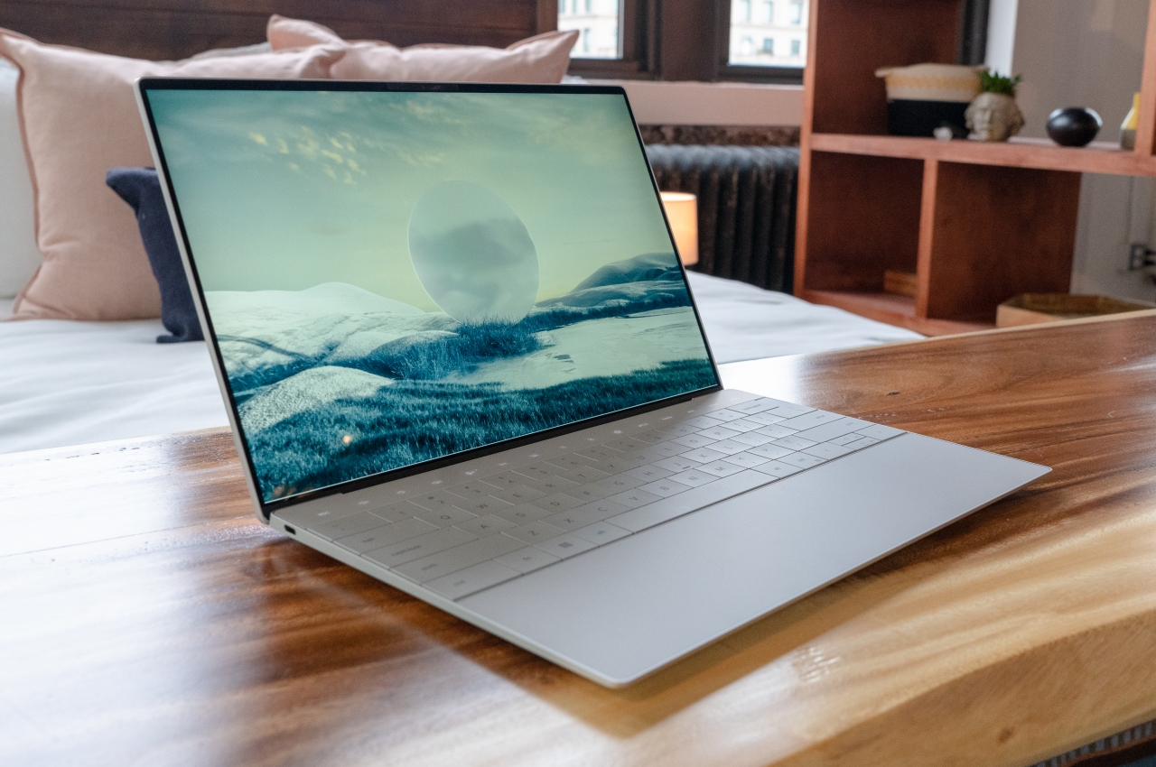
Compared to those two, Dell’s big changes to the laptop design almost look modest, though they carry their own head-scratching moments. In a nutshell, the new Dell XPS 13 Plus embraces minimalism to its fullest, giving the area opposite the display a completely flat look. That means no bumps and almost no gaps save for what’s necessary for the keycaps. Even then, the gaps are minimal, thanks to what Dell calls a “zero-lattice” keyboard.
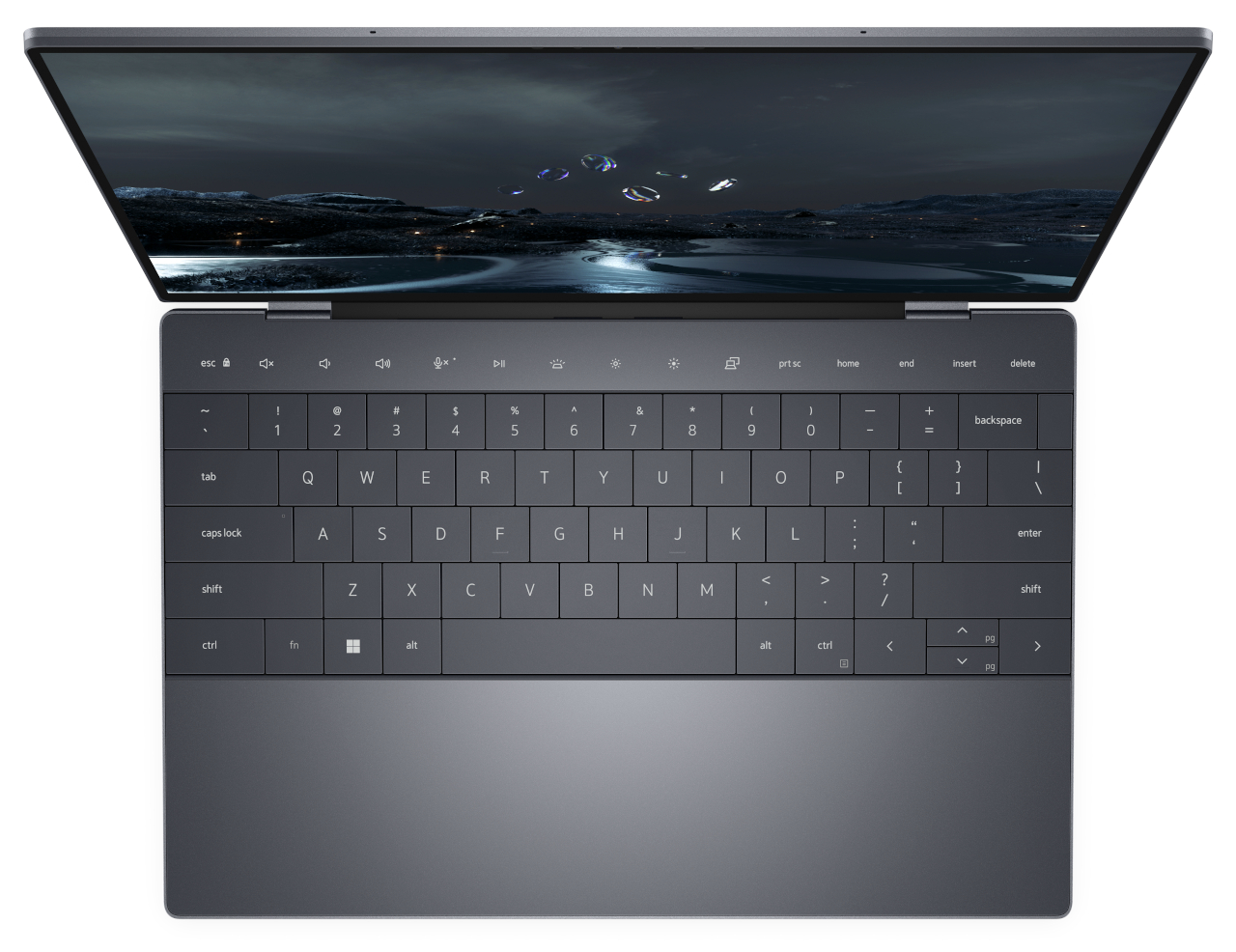
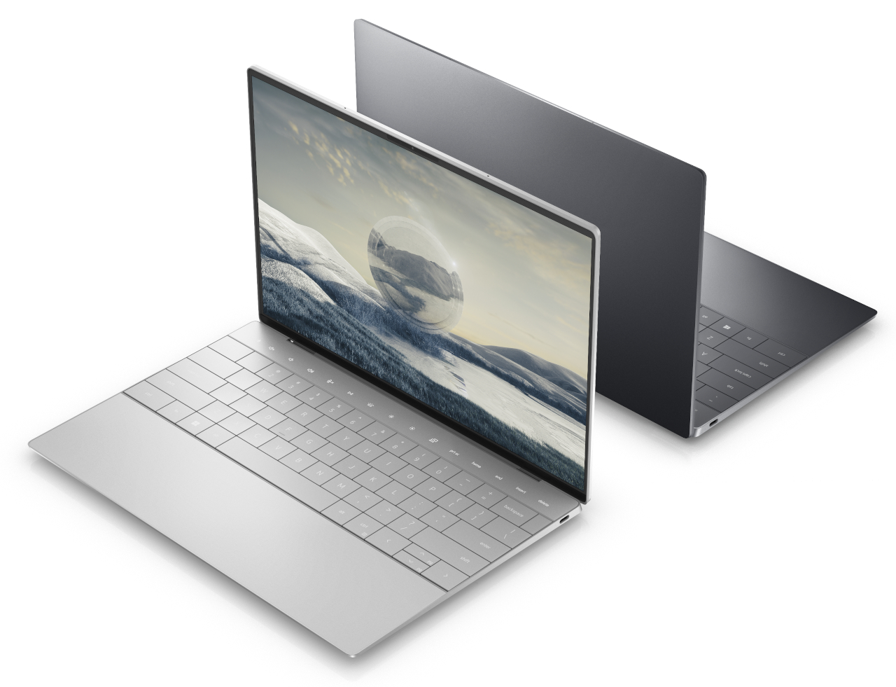
There’s also a touch-sensitive area above the keyboard that serves as the function keys. We’ve seen a similar technology with the MacBook Pro’s Touch Bar, which was equally controversial. The difference is that Dell’s version is clearly minimalist and blends cleanly into the background, without any visual separation between that area and the rest of the laptop.
The biggest change, however, is the invisible trackpad. It’s still there and occupies the same area as a regular trackpad, perhaps even bigger, but there’s no clear way for you to actually see where it is. You’re given haptic feedback, so you’re not completely clueless, but it remains to be seen (or felt) how effective that will be in practice.
Eye Candy, Touch-Deprived
Dell definitely accomplished what it set out to do with the Dell XPS 13 Plus. The laptop is truly beautiful and clean; a minimalist dream’s come true. As an added bonus, the PC maker took steps to reduce the carbon footprint of the laptop, both during its production as well as its packaging. It definitely checks most of the boxes of product design and sustainability. It does, however, leave some questions hanging when it comes to other aspects that would affect how people use the product.
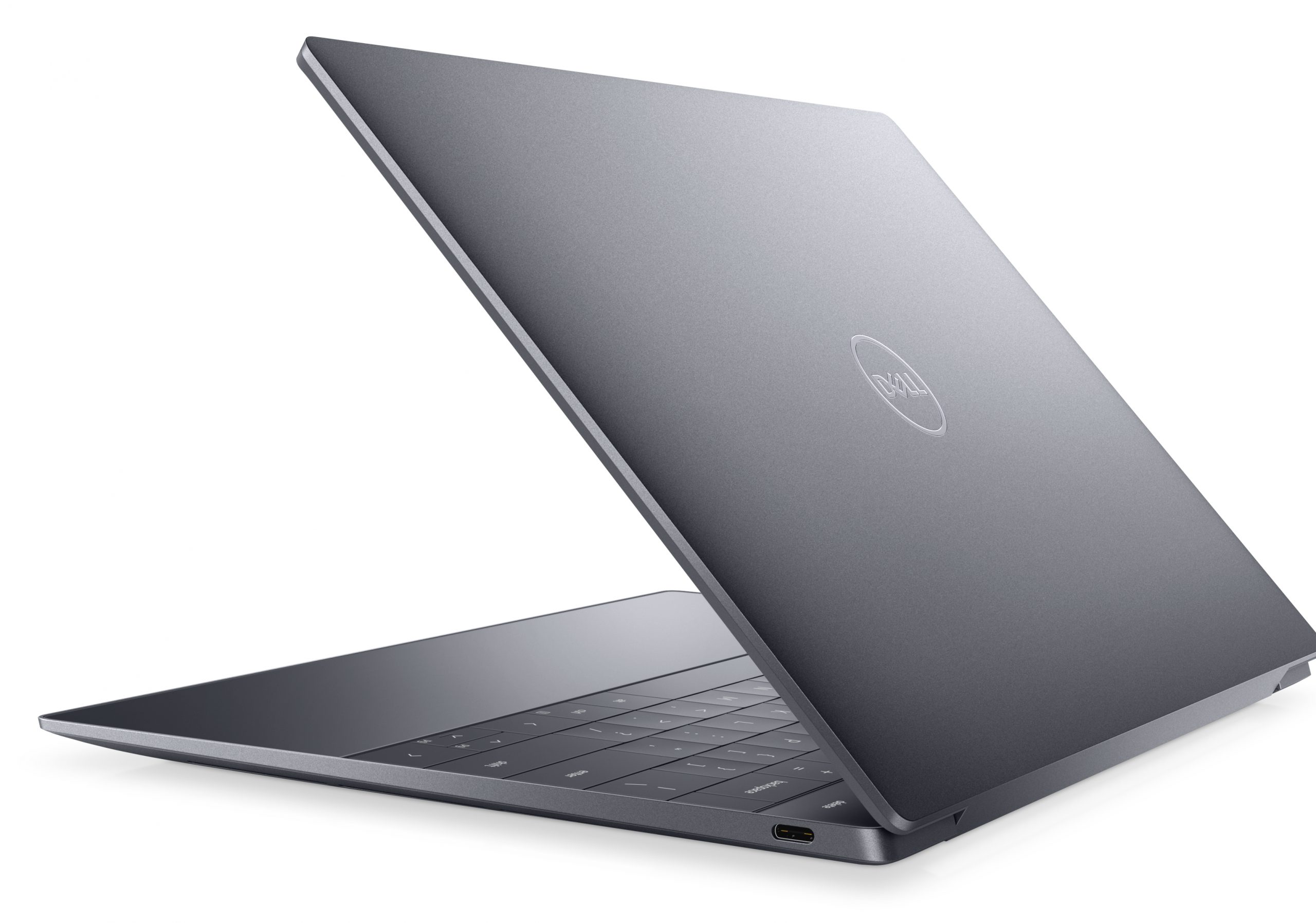
The MacBook Pro Touch Bar wasn’t exactly that popular, and the XPS 13 Plus’ version actually misses out on some of the flexibility and benefits of a screen-based solution in favor of a minimalist design. The lack of physical keys could make it harder to hit them by muscle memory, so you’ll always end up looking down. The same could almost be said of the zero-lattice keys, whose larger sizes could be negated by the very same thing that makes them special. Our fingers almost instinctively know the keys to hit, partly because of how they feel with those bumps and gaps in between keys.
The biggest question mark, however, is the invisible trackpad. It might take a lot of trial and error for people to get used to where the active area is or how far it extends. There is no argument that it definitely looks elegant in its cleanliness, and we give Dell the benefit of the doubt that it did due diligence in R&D, but we’ll have to wait and see for real-world feedback on whether this beautiful but unusual $1,299 laptop is worth those changes.
The post Dell XPS 13 Plus tries to evolve the laptop with questionable features first appeared on Yanko Design.
from Yanko Design

0 Comments