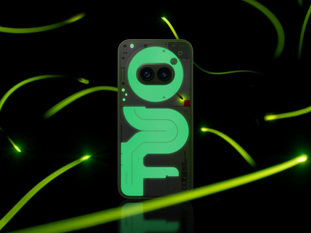
If you loved the Nothing Phone’s glyph interface, their Community Edition phone may just absolutely capture your heart. Announced today following a lengthy community-driven design competition, the Nothing Phone (2a) Plus Community Edition made its global reveal, with a unique twist on the original phone’s design. Sure, you’ve got the Glyph Interface with LEDs that glow to make the phone’s rear panel turn into a dynamic display for notifications and alerts, but the new Community-made version of the phone comes with literal glow-in-the-dark ribbon cables that are ‘nothing’ like anything we’ve seen on any phone in the past decade!
Thanks to input from community members Astrid Vanhuyse and Kenta Akasaki, this phone stands out in a crowd—but not with power-hungry LEDs. Instead, it uses a green phosphorescent material that charges up with ambient light, glowing gently in dim settings and giving the 2(a) a dose of unique, eco-friendly style.
Designers: Astrid Vanhuyse & Kenta Akasaki for Nothing
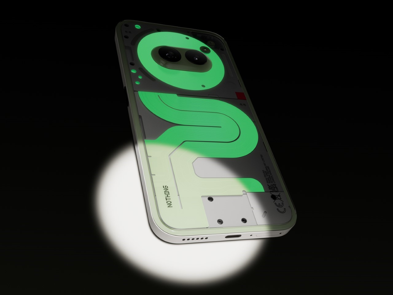
The design shift here is significant, especially if you remember the original Phone (2) and the less glowy Phone (2a). While the Phone (2) featured bright LED glyphs, the 2(a) kept things quieter, dialing back on the glow to maintain a sleeker look. This Community Edition, though, reintroduces some of that distinctive Nothing flair, swapping LEDs for a phosphorescent effect along the phone’s ribbon cables and components. It’s a subtler, softer glow that gives the phone character without the need for extra power or flashing lights. Imagine your phone lighting up on the nightstand—not enough to keep you awake, just enough to catch your eye.
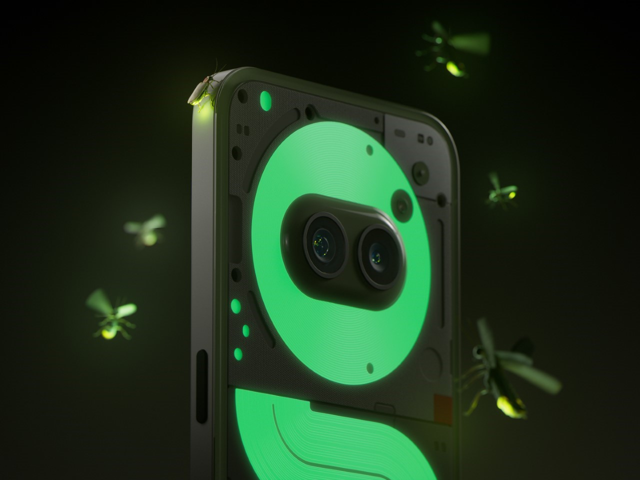
The phosphorescent material works just like those glow-in-the-dark stars you might have seen as a kid. It absorbs natural or artificial light and emits a soft glow when the lights go down. Unlike typical LEDs, it doesn’t drain the battery, giving this 2(a) a style boost without impacting battery life or performance. It’s the kind of understated cool that’s right in line with Nothing’s design philosophy: thoughtful, sustainable, and practical. Plus, it makes it easier to find in a dark room, giving the design a practical edge as well as aesthetic appeal.
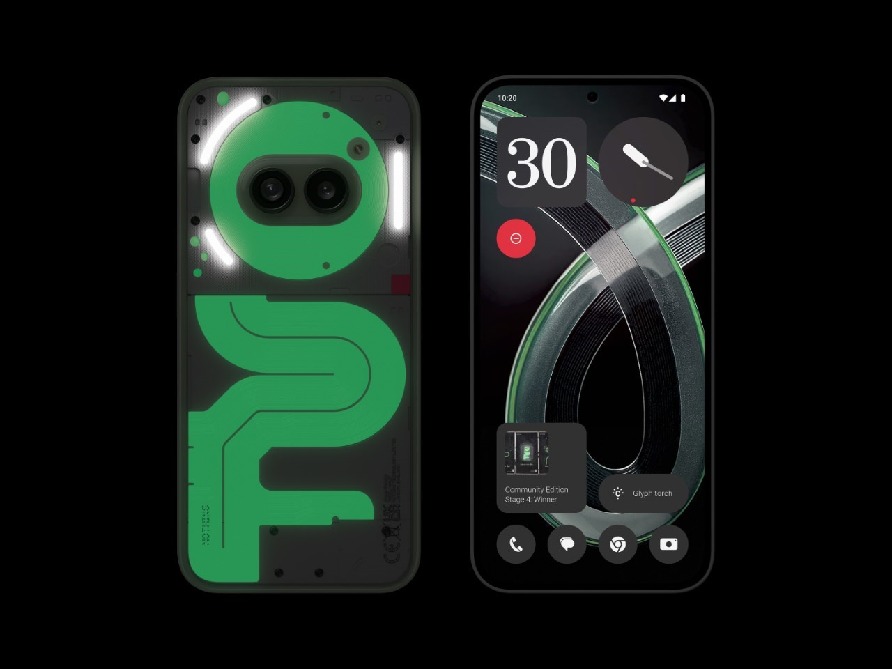
The collaborative effort on this phone really says a lot about Nothing’s approach to designing for their community. The company didn’t just create the effect on its own; they opened it up to the public and sorted through more than 900 design submissions from fans across 47 countries. Out of these, Vanhuyse and Akasaki’s concept shone the brightest, resulting in a design that feels distinctively Nothing while showcasing a global community’s creativity. It’s part of Nothing’s shift toward community-centric product innovation, giving fans a real voice in shaping what they carry.
Nothing also went to great lengths to ensure this glow effect wasn’t just a gimmick but a part of the Phone (2a) Plus Community Edition’s build. The phosphorescent material is durable and seamlessly integrated, meaning it won’t interfere with the phone’s performance or longevity. You get a sturdy device with an artistic edge, a blend of tech and simplicity that fits seamlessly into daily life.
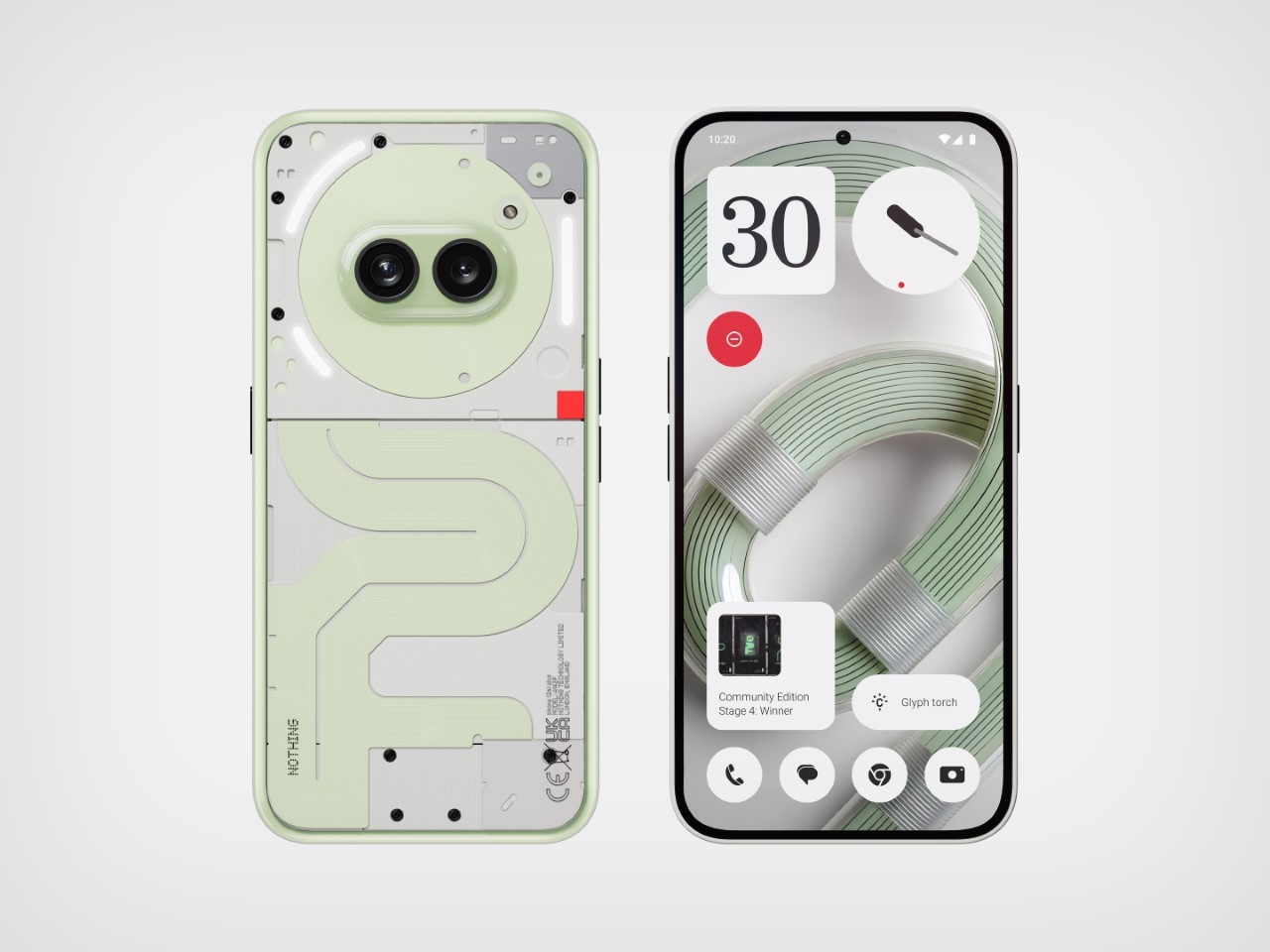
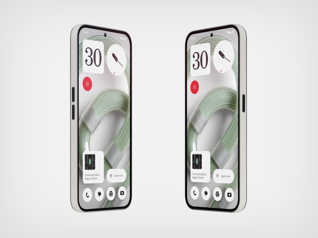
The Phone (2a) Plus Community Edition is priced at $518 USD (£399 / €449 / ₹29,999), with sales beginning on November 12. If you’re located in London, you might also grab one in person at the Nothing Soho store on November 16. There are just 1,000 units available up for grabs… so if you enjoy the idea of having a phone so dazzling that you’ll never want to put a case on it, grab one while you still can. And for anybody at dbrand or Spigen, you best believe people will want glowing cases for their iPhones and flagship Androids too!
The post Nothing’s Glow-in-the-Dark Phone (2a) Plus Sparks a New Design Trend: We Need Glowing Phone Cases! first appeared on Yanko Design.
from Yanko Design

0 Comments