When you’re the world’s biggest brand when it comes to PC gaming peripherals, it definitely speaks in your favor when your building looks exactly like one as well.
Few tech companies pay attention to how their own office buildings can become gigantic advertisements for their brand and identity. Apple, of course, is at the forefront of that appreciation, especially with the newer “spaceship” Apple Park in Cupertino embodying the company’s aesthetic and design language inside and out. Others, like Google and Meta, do take care to provide a comfortable, safe, and productive environment inside but don’t have much to show on the outside. Gaming brand Razer is setting itself apart and has turned its newest building into an architectural representation of what it means to be Razer.
Designer: Razer
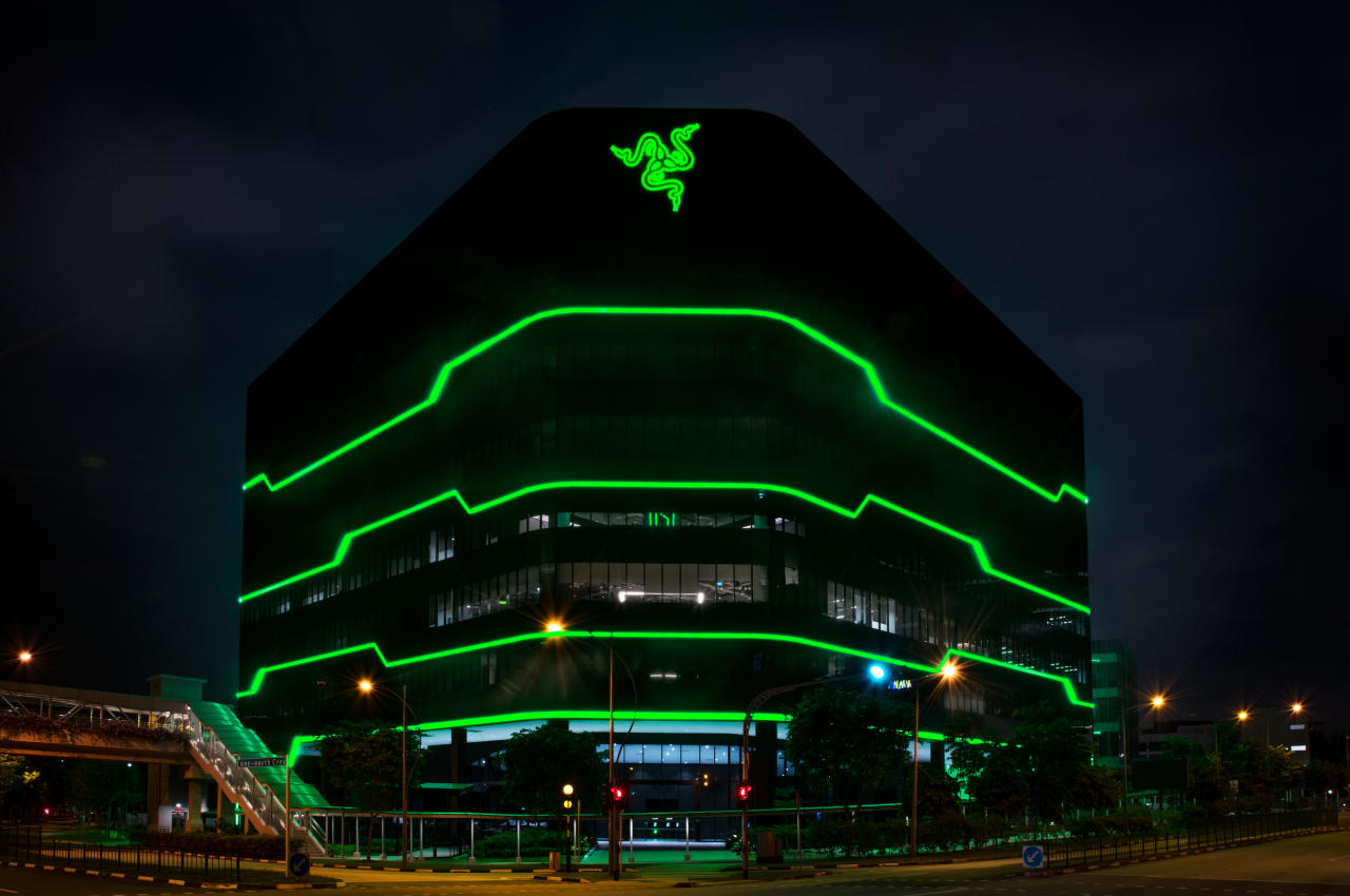
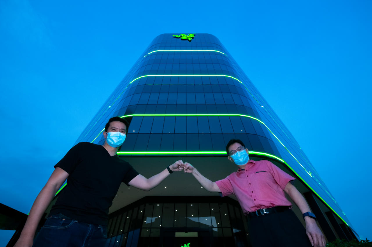
It’s easy enough to pick out Razer products from a lineup. Over the years, it has established a design language that has become unique to its brand, even ignoring the telltale three snakes logo. All Razer products, from PCs to accessories, carry a dominantly black motif with acid green lines for accents and highlights.
The company’s new Southeast Asian headquarters bears these same design cues, both on the outside as well as inside. Built on one-north, Singapore’s hub for tech and businesses, the Razer HQ’s tall, triangular shape is almost reminiscent of a PC hub for peripherals and accessories. That’s almost fitting given the building’s location as well as its purpose of being the company’s office hub for the region.
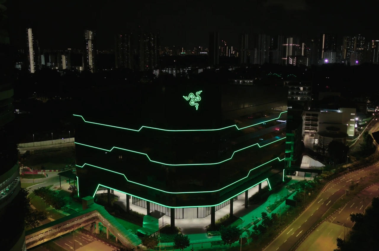
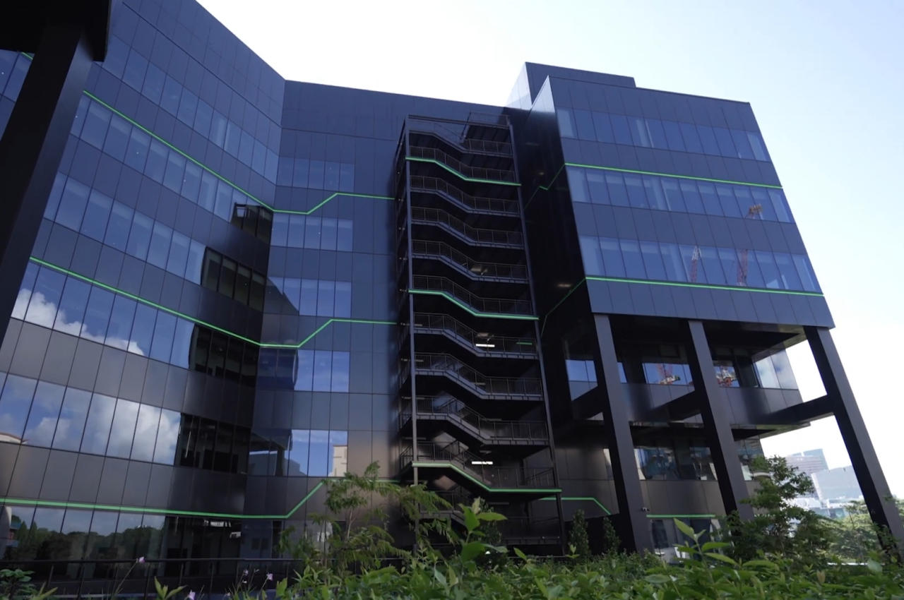
During the day, it’s harder to make out the building’s ties to Razer, with the green lines barely visible against the light reflected off the tinted glass windows covering the entire structure. Its informal shape still gives it a different and almost playful vibe in contrast to the other buildings around it. Of course, the large Razer logo dead center does mark it as the company’s territory, though not everyone will be familiar with the company’s core business.
It’s when the sun sets, and the external lights turn on that the building’s true nature is revealed. Those green lights that run across the building contrast sharply with the black facade, as well as the rest of the city lights and the night sky. In a single swoop, Razer not only established its presence in the area but also changed Singapore’s skyline in a way that’s totally Razer-like: bold, audacious, and attention-grabbing.
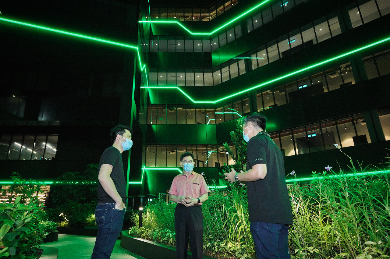
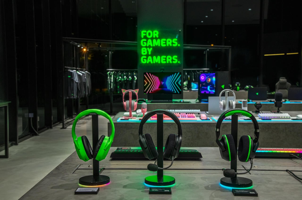
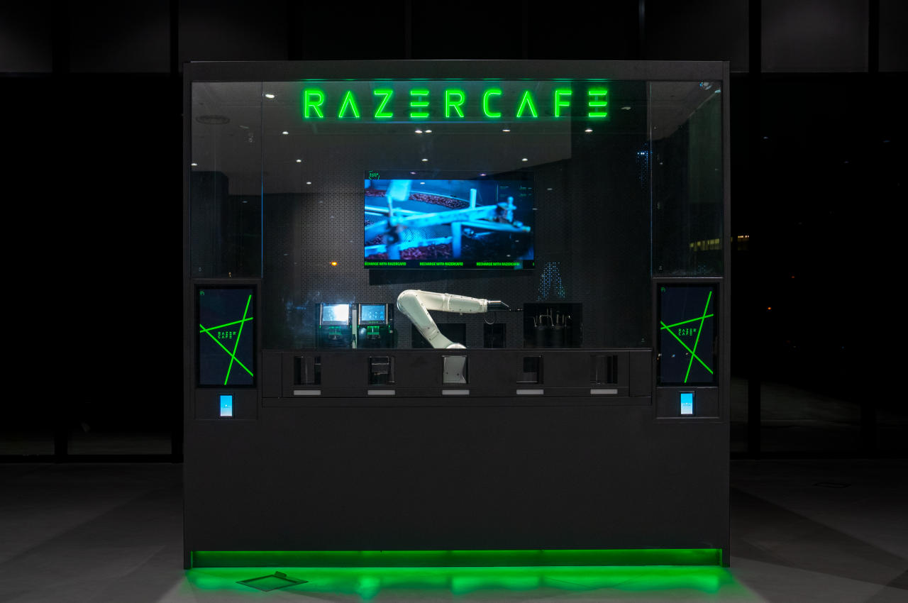
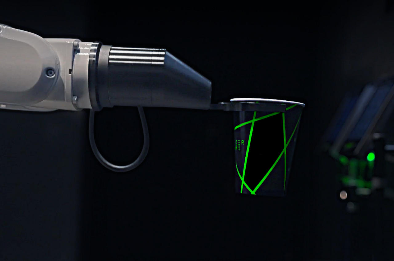
This motif continues indoors, but thankfully not in the actual office spaces. While visually interesting and exciting, a very dark space with only neon green lights would have been a terrible working environment, so it’s definitely reassuring that offices are properly lit and comfortable. The black and green theme does make its appearance in more commercial spaces, like a store and a cafe, complete with a robotic arm barista.
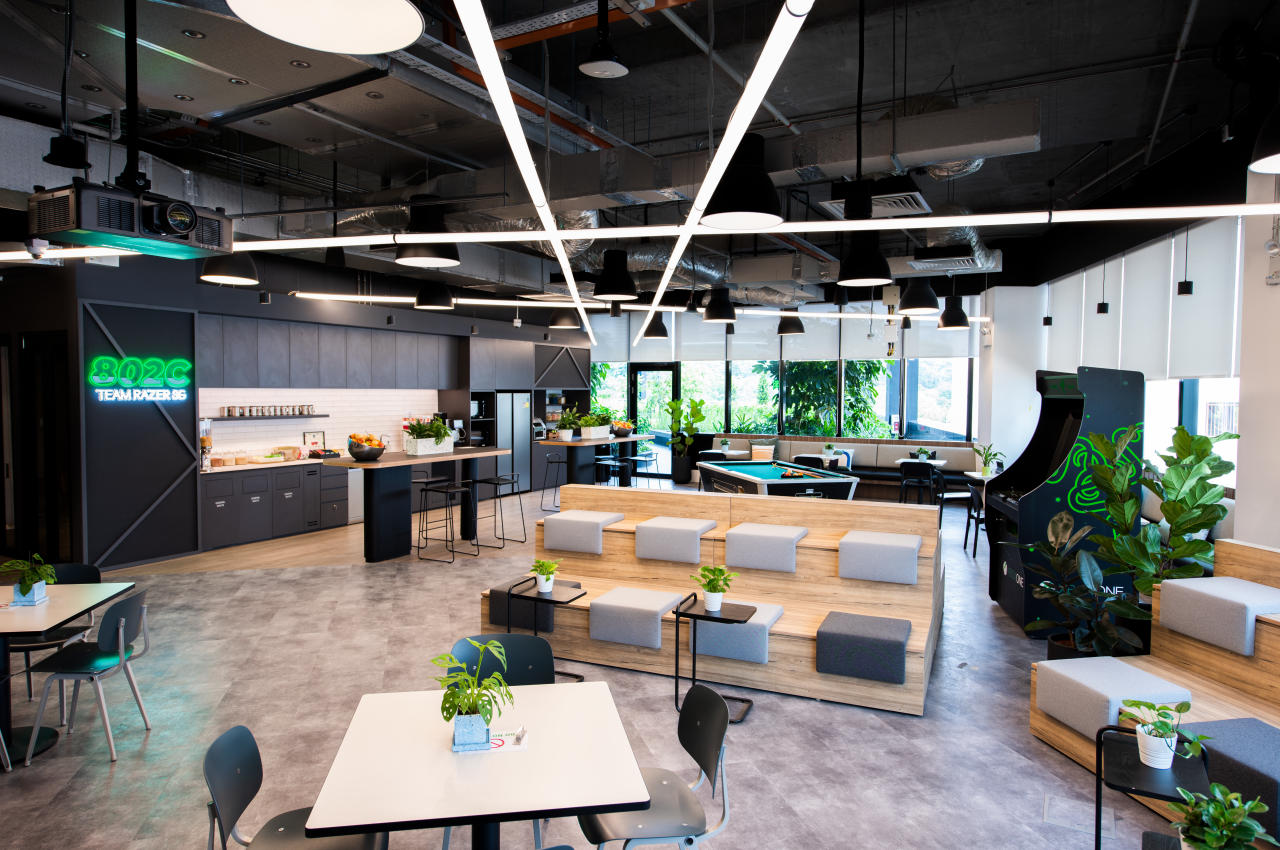
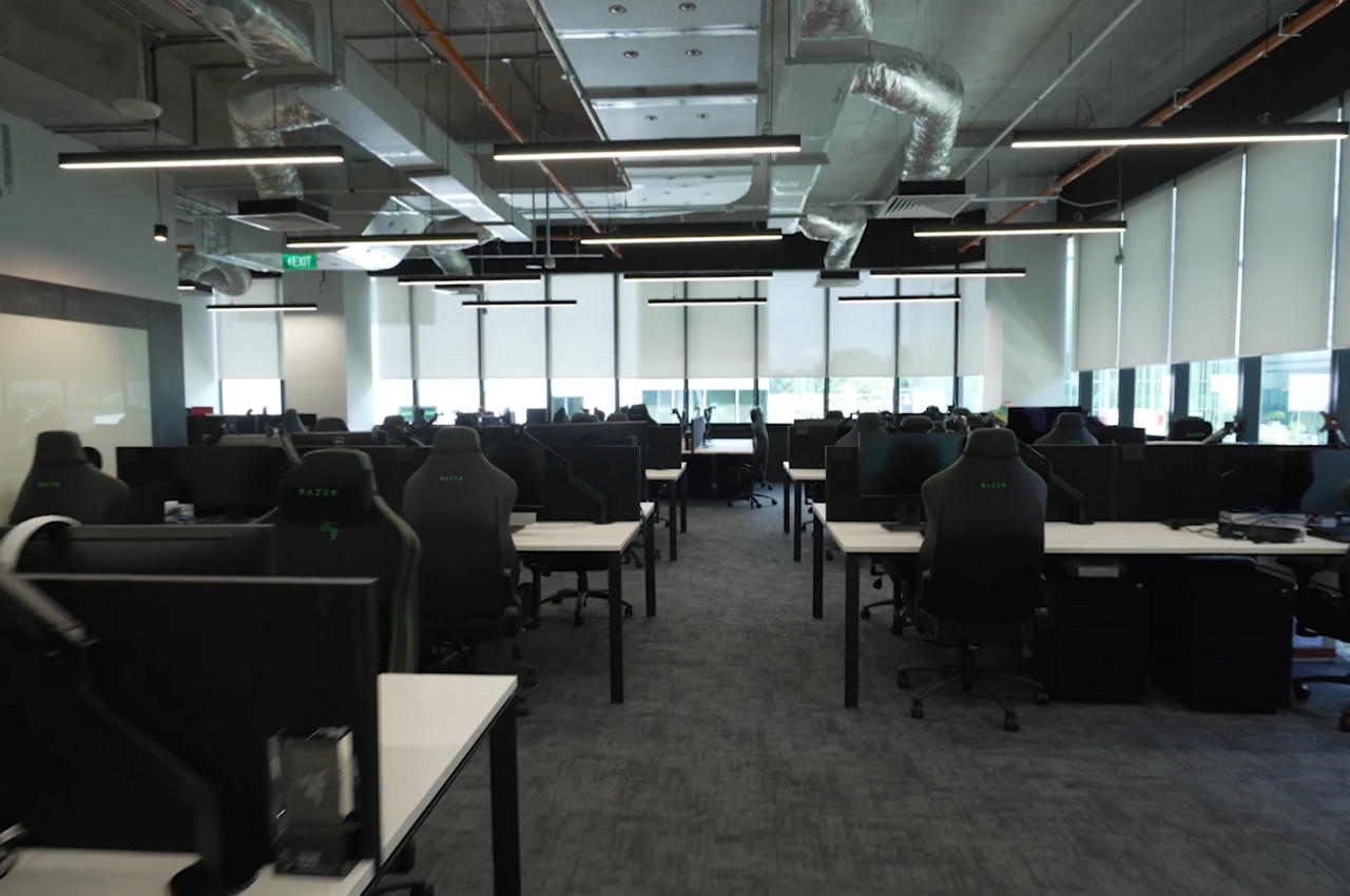
Razer’s new building isn’t exactly revolutionary in any way, especially when stripped of those highlights. It is, however, the combination of those little details that make the building special and help make Razer’s presence more felt and seen, especially to those unfamiliar with the brand. It’s the attention to those little details that sometimes seem insignificant that set companies apart, especially when they don’t shy from using their own building as a standing advertisement.
The post Razer Singapore HQ resembles a giant Razer-branded gaming accessory first appeared on Yanko Design.
from Yanko Design

0 Comments